What makes Ichimoku Dashboard different
- First standalone Ichimoku dashboard — no trading platform required
- Simultaneous overview of multiple instruments across multiple timeframes
- See multi-timeframe convergence and future cloud twists instantly, without opening a single chart
- Complete structural state of the five Ichimoku lines at a glance: Tenkan/Kijun position, Chikou freedom, SSA–SSB structure and trend direction
- A true Ichimoku control panel: trends, equilibrium, momentum and future bias visualized in one place
- Designed for learning, validation and preparation — from beginners to advanced traders
In summary
Understand Ichimoku faster.
See broader market structure.
Anticipate future equilibrium.
No more chart overload.
Save time. Focus on structure.
Ichimoku Dashboard dramatically reduces analysis time. Instead of opening and synchronizing hundreds of charts across multiple timeframes, the dashboard lets you scan an entire market universe in seconds.
Around 280 chart perspectives (36 instruments × 7 timeframes) are synthesized into a single structured view.
This makes it an ideal tool for traders, students and educators who want to understand market structure first, before thinking about execution.
More than Ichimoku alone
-
Ichimoku Kinko Hyo structural state
Complete reading of Tenkan, Kijun, Chikou, cloud position and future cloud structure -
Multi-timeframe RSI context
Visual identification of momentum zones and equilibrium ranges (no signal generation) -
VWAP positioning
Price location and slope relative to volume-weighted equilibrium -
Daily, weekly and monthly pivot levels
Key structural support and resistance references displayed by proximity -
ATR-based volatility context
Identification of calm, normal or extreme market conditions -
EMA & SMA structural alignment
Trend organization and internal market coherence -
Major price interaction zones
Areas where price meets statistically meaningful levels
Not a signal copier. Not an automated system.
Ichimoku Dashboard is not a signal copier, not a trading robot and not an automated strategy.
It does not execute trades and does not provide buy or sell recommendations.
It is a purely educational market visualization tool.
How to read the dashboard
Each timeframe is summarized by two compact lines. Together, they describe market structure and price interaction with key levels, using a consistent Ichimoku-based logic.
Line 1 — Market structure
Example:
F
↑
TK
↓
53
↑
S–
E
C
In this example, the Chikou is free on the bearish side. Tenkan is below Kijun, defining a bearish short-term structure. RSI is above 50 and rising, showing improving momentum. The SMA structure is bearish, while the EMA structure is bullish, and the current cloud is bullish.
| Element | Meaning |
|---|---|
| F F F |
Chikou state Green Chikou free on bullish side Red Chikou free on bearish side Blue Chikou inside price action |
|
TK
TK ↑ ↓ − |
Tenkan / Kijun relationship Green TK Tenkan above Kijun (bullish structure) Red TK Tenkan below Kijun (bearish structure) Slopes: ↑ rising · ↓ falling · − flat |
|
RSI
RSI ↑ ↓ − |
RSI value and momentum Green RSI above 50 Red RSI below 50 Slope: ↑ rising · ↓ falling · − flat |
| S S S – E E E |
Moving averages alignment S = SMA 7 / 10 / 20 Green bullish alignment Red bearish alignment Blue mixed or neutral E = EMA 30 / 50 Same color logic applies |
| C C C |
Current Ichimoku cloud Green SSA > SSB (bullish cloud) Red SSA < SSB (bearish cloud) Blue flat or neutral cloud |
Line 1 answers a single question:
what is the current market structure?
Line 2 — Price interaction & key levels
Example (M15):
↑
P–
R1
P–
S1
L
↓
V
↑
On M15, the SMA 7 is rising, indicating short-term upward momentum.
Price is currently positioned between the daily pivot (P) and the daily resistance R1,
with the pivot displayed first because it is the closest level.
At the same time, price is located between the weekly pivot (P) and the weekly support S1,
and is very close to the weekly pivot,
highlighted by the surrounding circle.
Volatility is low (ATR = L), suggesting a calm or compressed market environment.
The VWAP is sloping downward, while price is very close to VWAP
(also highlighted by a surrounding circle).
Meanwhile, the EMA slope is rising,
revealing a short-term tension between
momentum and mean reversion.
| Element | Meaning |
|---|---|
| ↑ ↓ − |
SMA 7 slope ↑ rising: short-term bullish momentum ↓ falling: short-term bearish momentum − flat: neutral or transitional state |
| P R1–R12 S1–S12 |
Pivot levels (price interaction) Displays the two closest pivot levels around the current price. Order matters: P– R1 ≠ R1– P The closest level is always shown first. Encircled indicates very close price proximity, often acting as a short-term reaction or decision zone. |
| Pivot sets |
Pivot timeframe logic M1 / M5 / M15 / H1 → Daily & Weekly pivots H4 / DAY → Weekly & Monthly pivots WEEK → Monthly pivots only |
| L · M · H · X |
ATR volatility context L: low volatility — compressed or ranging structure M: balanced volatility — structure often clearer H: expansion phase — structure evolves quickly X: extreme volatility — often news-driven, requires caution ATR provides context, not signals. |
|
V VL · VN · VH VL · VN · VH |
VWAP position & distance to equilibrium VWAP represents the volume-weighted equilibrium price. V indicates price is very close to VWAP, often reflecting a balance or decision zone. Position: Above VWAP — bullish structural bias Below VWAP — bearish structural bias Distance: VL = close · VN = normal · VH = extended VWAP helps assess whether price is balanced, expanding, or overextended. |
| ↑ ↓ − |
EMA 7 slope ↑ directional support ↓ directional pressure − neutral or transitional phase |
Line 2 answers a single question:
where is price interacting with structure and key reference levels?
Future cloud dynamics
This section describes the potential movement and stability of the future Ichimoku cloud. It focuses exclusively on SSA momentum, independently from current price action.
| Symbol | Meaning |
|---|---|
|
SSA slope at Chikou level Measures the direction of SSA between −26 periods (Chikou level) and SSA projected +26 periods ahead. This symbol reflects the structural momentum already in place before the future cloud fully forms. ▲ Rising strengthening structure ▼ Falling weakening structure ■ Flat neutral or balanced structure |
|
|
Future SSA slope Compares SSA projected at +26 and +25 periods ahead. This symbol captures the current acceleration, deceleration or inflection of the future cloud. ▲ Rising accelerating future bias ▼ Falling deteriorating future bias ■ Flat hesitation or transition |
Together, these two symbols provide an early read of future cloud direction, stability and acceleration, often before twists or regime changes appear on price.
Market structure intensity
Background colors are used to express
trend strength, stability and structural quality
at a glance.
They are contextual visual cues,
not trading signals.
Current market structure (price vs cloud)
Ichimoku is primarily a trend-following indicator. When RSI oscillates between 40 and 60, markets are often ranging or transitioning, and trend-based readings should be interpreted with caution.
Price above cloud · RSI 40–60
Transitional or ranging environment
Price above cloud · RSI 60–70
Price above cloud · RSI > 70
Extended or overbought conditions possible
Price inside the cloud
Non-trending or indecisive structure
Price below cloud · RSI 40–60
Price below cloud · RSI 30–40
Price below cloud · RSI < 30
Extended or oversold conditions possible
Future cloud structure
The future cloud represents a projected structural bias. A detected twist does not reverse the trend by itself, but signals a potential weakening or transition of the current structure.
Future cloud bullish · no twist ahead
Structural continuity
Future cloud bullish · twist detected
Potential loss of momentum
Future cloud bearish · no twist ahead
Future cloud bearish · twist detected
Detected market events
Ichimoku Dashboard continuously scans markets to detect structural events derived from Ichimoku logic, volatility context and key price reference levels.
These events are not trading signals. They highlight moments where market structure becomes technically and statistically significant.
| Event family | Description | Structural meaning |
|---|---|---|
| Tenkan–Kijun Cross | Tenkan crosses Kijun with Chikou validation | Early momentum shift inside an existing structure |
| Price–Kijun Cross | Price closes across Kijun while respecting Tenkan | Price re-alignment with Ichimoku equilibrium |
| Kumo Breakout | Price exits the Ichimoku cloud (future cloud read) | Structural regime change (range → trend) |
| Chikou–Price Cross | Chikou Span crosses historical price | Validation or invalidation of directional bias |
| Chikou–Cloud Cross | Chikou Span crosses historical cloud | Deep structural confirmation or exhaustion |
| Future Cloud Twist | SSA / SSB crossing in projected cloud | Anticipation of future equilibrium inversion |
| Pivot Breakout | Clean break of daily pivot levels (R1 / S1) | Directional expansion supported by structure |
| Pivot Retest | Breakout followed by controlled retest | Structural validation of support or resistance |
| ATR Context Rejection | Volatility-based rejection near extreme levels | Potential structural exhaustion zone |
| SSB Proximity | Price interaction with flat or key SSB levels | Major equilibrium magnet or structural barrier |
Each event is evaluated using a multi-factor model:
Ichimoku structure, RSI / ADX filters,
volatility context and multi-timeframe consensus.
Only events reaching a minimum level of
structural relevance
are displayed.
How detected events relate to the dashboard
Detected events are not trading signals and should not be interpreted as execution instructions.
They represent temporary structural events, identified when multiple dashboard conditions align on the same timeframe (Ichimoku structure, momentum, volatility and key levels).
Each event is therefore a contextual highlight: it names a moment where the market structure becomes technically meaningful — nothing more, nothing less.
Events are time-bound. They automatically disappear after a limited number of candles on the corresponding timeframe (typically a few bars), if the structure does not persist or confirm.
In other words:
the dashboard shows the structure — events simply label it,
temporarily.
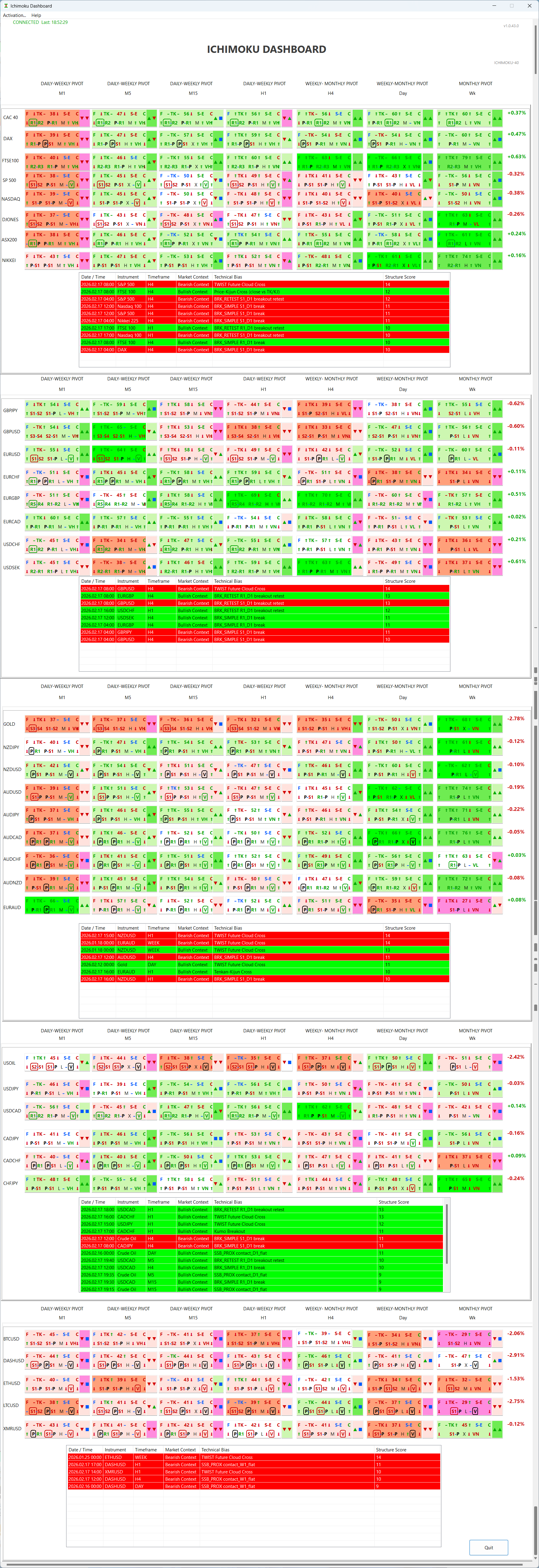
Explore the dashboard
Below is the full Ichimoku Dashboard interface. After learning how to read it, take your time to explore all timeframes and indicators at your own pace.
Simple installation & activation
Download the application
Designed for Windows 10 & 11. macOS version not currently supported.
Official public release pending payment provider validation.
Generate activation code & order
Launch the dashboard, open the Activation panel and copy your personal device fingerprint.
Activate your license
After receiving your license file by email, load it inside the dashboard to activate.
If you encounter any issue generating your activation code, please contact support@ichimokudashboard.com.
System requirements
- Windows 10 or later
- Minimum 4 GB RAM
-
Recommended screen size: 15″ or larger
(the application interface is not case-sensitive and is designed to display a large amount of information at once) - Recommended resolution: 1920 × 1080
-
Internet connection required
for license activation, periodic validation, and regular dashboard data updates
Educational partnerships
Training centers and Ichimoku educators are invited to contact us for educational partnerships.
📩 contact@ichimokudashboard.com
Educational Licensing
Ichimoku Dashboard is distributed under a
single-user educational license.
This software is strictly a market visualization tool.
It does not provide financial advice,
trading recommendations, or investment services.
1 Month Access
€39
30 days access
-
Access to 36 major market instruments
Indices, forex, metals and selected crypto assets -
Multi-timeframe structural visualization
Complete Ichimoku, RSI, VWAP, pivots and volatility context -
Single-machine educational license
Activation linked to your device fingerprint
One-time payment. No automatic renewal.
Get access3 Months Access
€99
90 days access
-
Access to 36 major market instruments
Indices, forex, metals and selected crypto assets -
Multi-timeframe structural visualization
Complete Ichimoku, RSI, VWAP, pivots and volatility context -
Single-machine educational license
Activation linked to your device fingerprint
One-time payment. No automatic renewal.
Get access12 Months Access Popular
€349 €249
365 days access
-
Access to 36 major market instruments
Indices, forex, metals and selected crypto assets -
Multi-timeframe structural visualization
Complete Ichimoku, RSI, VWAP, pivots and volatility context -
Single-machine educational license
Activation linked to your device fingerprint
One-time payment. No automatic renewal.
Recommended for long-term study.
Get access-
License valid for one device only
Machine fingerprint required for activation -
Manual license delivery within 24 hours
Sent after activation code and email verification - Email confirmation required during checkout
- No automatic subscription or recurring billing